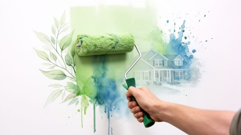
Your Dream Kitchen is Just a Paint Can Away
You’re standing in the kitchen again, looking at cabinet doors that still work fine but make the whole room feel older than it is. Maybe it’s a downtown condo with flat maple fronts that have yellowed a bit over time. Maybe it’s a semi-detached in East York with solid boxes and dated oak doors. Maybe you’re getting a home ready for market and know the kitchen has to feel cleaner, brighter, and more current without turning into a full renovation.
That’s where cabinet painting makes sense.
In Ontario, renovation spending has been huge for years. Statistics Canada reported that households spent about CAD 80.0 billion on renovations in 2019, and Ontario accounted for roughly CAD 25.1 billion, or about 31% of the national total, as summarized in this overview of kitchen cabinet colour trends in Canada. In practical terms, that’s why cabinet refinishing has become a standard value-upgrade in the GTA instead of a niche idea. Homeowners want a visible change, but they also want to avoid the mess, cost, and downtime of tearing out a functional kitchen.
The best cabinet painting ideas don’t just look good in a photo. They have to suit your light, your layout, your lifestyle, and your resale goals. A dark loft kitchen needs different choices than a bright detached home in Oakville. A rental turnover in North York needs a different finish strategy than a forever-home kitchen in the Beaches.
Here are 10 cabinet painting ideas that work in real Toronto homes, plus the trade-offs that matter before you commit.
Table of Contents
- 1. Two-Tone Cabinet Painting
- 2. Soft White and Neutral Cabinet Finish
- 3. Navy and Charcoal Deep Colour Cabinet Painting
- 4. Matte and Satin Finish Application
- 5. Sage Green and Soft Green Cabinet Colour
- 6. Ombre and Gradient Cabinet Painting
- 7. High-Gloss and Semi-Gloss Professional Cabinet Finish
- 8. Espresso and Dark Brown Cabinet Colour
- 9. Soft Blush and Warm Gray Cabinet Colour
- 10. Staining and Wood Grain Enhancement Technique
- Top 10 Cabinet Painting Ideas Comparison
- Ready to Transform Your Toronto Kitchen?
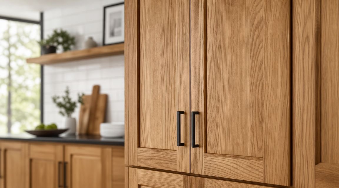
1. Two-Tone Cabinet Painting
Two-tone cabinets are one of the easiest ways to make an average kitchen look more custom. In Toronto homes, I see this work especially well in semis, townhomes, and condos where the kitchen opens straight into the living area. The contrast gives the room structure without adding bulk.
The strongest version is still light uppers and darker lowers. That isn’t just designer preference. A 2026 Houzz Kitchen Trends Study cited by IST Cabinets says wood-toned cabinetry overtook white for the first time at 29% versus 28%, and about 24% of renovating homeowners chose contrasting upper and lower cabinet colours. It also notes the most common two-tone setup is lighter uppers with darker lowers, as outlined in these modern kitchen cabinet ideas from IST Cabinets.
Why it works in Toronto kitchens
In a smaller condo kitchen, dark lowers ground the room while lighter uppers keep it from feeling boxed in. In an older detached home with mixed finishes, two-tone painting can bridge old countertops or flooring better than a single all-over colour. Cream uppers with navy lowers, soft greige uppers with charcoal lowers, and warm off-white uppers with deep brown lowers all tend to read polished without feeling trendy for trend’s sake.
Practical rule: Match the island to either the lowers or make it the darkest feature in the room. Don’t give every cabinet bank its own colour.
A clean split line matters. If the uppers and lowers meet at pantry units, gables, or fridge panels, the colour break has to look intentional. That’s where many DIY jobs start to wobble visually.
If you want extra inspiration beyond local pairings, these paint colours for South Jersey kitchen cabinets show combinations that translate well to GTA homes too.
2. Soft White and Neutral Cabinet Finish
Soft white is still the safest cabinet colour family for resale. I’m not talking about a bright, icy builder white. I mean warmer whites, creams, linen tones, and quiet neutrals that soften the kitchen without making it feel yellow.
This is the finish I’d suggest first for a Liberty Village condo, a Leaside family kitchen with limited natural light, or a listing prep job where the goal is broad appeal. It works because it reflects light, suits almost any backsplash, and doesn’t force the rest of the room into one style direction.
What works better than stark white
The mistake is choosing a white that ignores the fixed finishes. If the counters have warm veining or the floor leans beige, a cold white can make the whole kitchen feel slightly off. Soft white tends to be more forgiving.
For durability, the system under the colour matters as much as the colour itself. If you’re comparing coating systems, this guide to the best primer for kitchen cabinets is worth reviewing before you lock in your paint plan.
A few combinations that usually behave well in Toronto kitchens:
- Warm white with black hardware: Good for condo kitchens that need contrast without darkness.
- Cream with brushed nickel: Safer for transitional homes with existing stainless appliances.
- Light greige-neutral with white quartz: Helps newer kitchens feel less sterile.
Benjamin Moore’s cabinet guidance emphasizes proper cleaning, sanding, priming, durable interior products, and long dry times for cabinets in active kitchens, which is covered in their kitchen cabinet ideas and inspiration guide. That’s why a soft neutral can look great for years, or start chipping early if the prep was rushed.
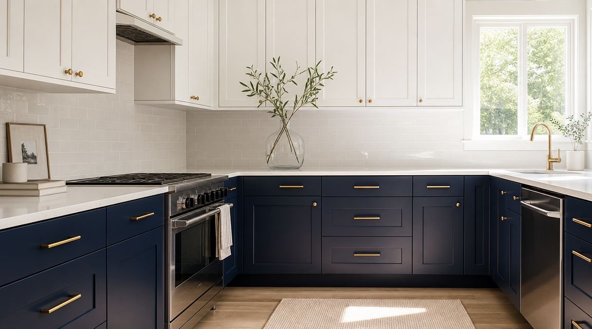
3. Navy and Charcoal Deep Colour Cabinet Painting
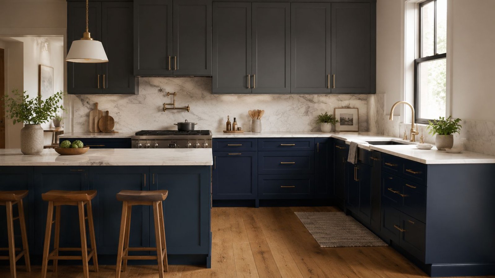
You walk into a downtown Toronto condo after sunset, switch on the under-cabinet lights, and the kitchen finally has some presence. That is where navy and charcoal earn their place. In lofts with exposed brick, black frames, or concrete finishes, these colours usually feel more grounded than another pale neutral.
They can also be practical. Deep colours hide small scuffs, grease haze, and daily wear better than white, though fingerprints still show around pulls and touch points. Charcoal usually reads cleaner and more modern. Navy adds colour without feeling trendy in a way that hurts resale a few years later.
The room still needs balance. In a narrow semi-detached kitchen with limited daylight, full-height dark cabinetry can make the space feel tighter. In a bright condo or an open main floor with white counters, pale walls, and decent lighting, the same colour can look well-designed and expensive.
I usually steer Toronto homeowners toward using deep colour with some restraint if resale is part of the plan. Lower cabinets, an island, or a single wall of cabinetry often lands better in the GTA market than painting every box dark. Buyers tend to respond well when the kitchen feels current but still easy to personalize.
Where navy and charcoal make the most sense
These shades tend to work well in a few common local situations:
- Lofts and modern condos: Great with black hardware, quartz, and industrial finishes.
- Updated semis: Best on lowers or an island, especially if the uppers stay light.
- Older kitchens with good layout but dated doors: A charcoal repaint can make the room feel far more current without a full renovation.
Application matters more here than homeowners expect. Deep colours show lap marks, thin coverage, and door edge buildup fast. If the prep is sloppy, you see it. If the spray and cure process is handled properly, navy and charcoal can look sharp for years.
Budget-wise, this choice usually does not change the cabinet painting price much on its own, but it can add a bit of labour if extra coats are needed for even coverage. In Toronto, a professional cabinet painting project for an average kitchen often runs on a similar schedule as other colours, with setup, prep, spraying, drying, and reinstall taking several days to about a week depending on layout, access, and how occupied the home is.
For design guidance, Sherwin-Williams highlights dark blue and charcoal kitchen palettes as strong options when the space has enough contrast and supporting light finishes in its kitchen cabinet color ideas. That lines up with what I see on site. Deep cabinet colour works best when the room is built to carry it.
4. Matte and Satin Finish Application
People often ask for matte cabinets because they like the look online. In person, satin is usually the smarter move. Matte can be beautiful, but kitchens aren’t photo shoots. They’re high-touch, high-moisture workspaces.
The finish level changes how the colour reads and how the cabinets age. A matte surface can feel modern and soft, especially in newer condos or minimalist homes. But it also tends to show grease smudges differently and can be fussier to clean if the coating system isn’t built for it.
Choosing sheen for real life
Satin is the middle ground I trust most. It gives enough washability for family use, enough softness to avoid that plastic shine, and enough forgiveness to keep small defects from becoming the first thing you notice.
HomeStyler recommends durable, washable acrylic-based enamel for kitchen cabinets, which is one of the clearer practical takeaways in their piece on creative kitchen cabinet painting ideas. That lines up with what holds up well in active kitchens.
A quick way to think about finish choice:
- Matte: Better for low-use kitchens, design-forward spaces, or feature areas.
- Satin: Best all-around choice for most owner-occupied homes.
- Higher sheen: Better if cleanability matters more than subtlety.
If you have older oak or open-grain wood, keep this in mind. Sheen can exaggerate texture. Satin usually gives a cleaner result than either dead matte or overly glossy topcoats on that substrate.
5. Sage Green and Soft Green Cabinet Colour
Sage green has staying power because it doesn’t fight the rest of the kitchen. It brings in colour, but it still behaves like a neutral when the shade is muted enough. In Toronto, this colour family works especially well in homes that already have warmth. Think original hardwood, cream tile, brass accents, or soft stone counters.
I like sage most in kitchens that need personality but shouldn’t feel loud. It suits renovated semis, updated bungalows, and even some modern farmhouse-leaning spaces in the GTA. It can also soften newer condo kitchens that feel too monochrome.
Best fit for GTA homes
The version that ages best is greyed-down green, not bright herbal green. You want something that still looks grounded on an overcast winter day, because Toronto light changes a lot by season. A green that feels airy in a showroom can go muddy in a north-facing kitchen.
Use it on all cabinets if the room is bright, or keep it on lowers and an island if light is limited. Pair it with warm white walls, simple hardware, and a quiet backsplash. If you add too many competing patterns, green can start to feel busy.
In family kitchens, sage often lands in the sweet spot. It’s warmer than blue, less expected than white, and easier to live with than trendier statement colours.
For resale, I’d call this design-forward but still reasonable. Buyers in the GTA are used to seeing more personality now than they were years ago, but they still want the kitchen to feel easy to inherit.
6. Ombre and Gradient Cabinet Painting
Ombre cabinets are the most specialized idea on this list. When they’re done well, they look custom and artistic. When they’re done badly, they look like colour matching went wrong.
This technique makes sense in a statement kitchen, not a basic refresh. A downtown loft, a designer-led renovation, or a feature island can carry it. A standard resale-focused repaint usually shouldn’t.
When to use it and when to stop
The best place for a gradient is a contained zone. An island. A tall pantry wall. A small run of cabinetry where the transition can read intentionally. Doing an entire average-sized kitchen in a gradient often creates more visual noise than payoff.
Spray application is usually the only way to keep the blend clean enough. Hand-brushed gradient cabinets rarely give the soft transition people expect from the idea.
If you’re curious about the workflow behind higher-end finishes, this walkthrough on how to paint kitchen cabinets professionally gives a useful starting point before you attempt anything layered or custom.
This is also one of the few cabinet painting ideas where future touch-ups become a real concern. If a single door gets damaged later, matching the transition exactly can be difficult. That’s why I’d reserve this look for homeowners who want something distinct and understand the maintenance trade-off.
7. High-Gloss and Semi-Gloss Professional Cabinet Finish
If matte is the style-driven choice, semi-gloss is the workhorse. It has been a standard for years for a reason. It cleans more easily, resists kitchen grime better when properly cured, and gives cabinet doors a crisp, finished look.
High-gloss is more selective. It can look sharp in a modern condo or a compact galley kitchen, but it magnifies every flaw in the substrate and every shortcut in prep. On older cabinet doors with dents, grain, or patchwork repairs, it’s often too unforgiving.
Best uses for durable shine
Semi-gloss makes the most sense in rental units, family kitchens, and turnover projects where durability and wipeability matter. That’s also why property managers across the GTA tend to stay practical with sheen.
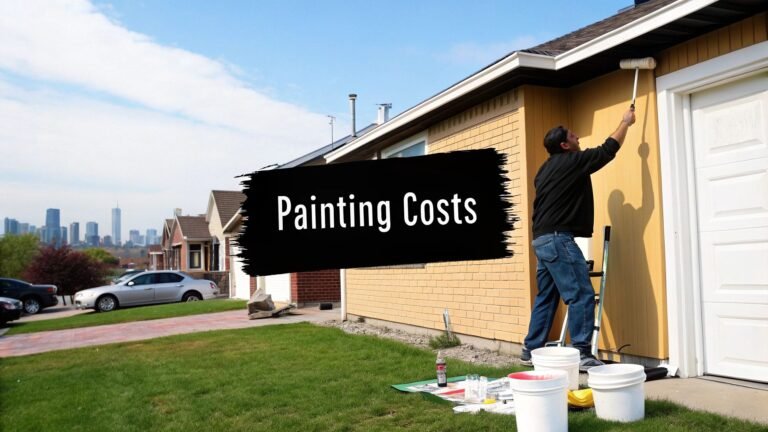
Angi’s 2026 cabinet-painting cost data puts professional kitchen cabinet painting at an average of about $938, with a common range of $425 to $1,463, and notes that labour typically accounts for roughly 70% to 80% of the total in their guide to cabinet painting costs. That tells you where true value is. Not in shaving a few dollars off the paint can, but in getting prep, masking, and application right.
For smoother results, spray methods often outperform brush-and-roll on cabinet fronts, especially when you want a tighter film build and fewer texture marks. This overview of spray painting kitchen cabinets explains why that method is often chosen for more polished finishes.
- Semi-gloss for rentals: Easier cleaning and a familiar finish.
- Semi-gloss for family homes: Better compromise between shine and upkeep.
- High-gloss for select projects: Best only when the substrate is excellent.
8. Espresso and Dark Brown Cabinet Colour
Dark brown is one of the most underused cabinet colours right now. Everyone talks about black, navy, and green. Espresso often gets ignored, even though it can feel warmer and more expensive-looking in the right kitchen.
This colour works particularly well in Toronto homes with natural materials. Walnut floors, brass lighting, creamy stone, and warm plaster-like wall colours all pair nicely with it. It also suits older homes where a cooler charcoal might feel too sharp against the architecture.
How to keep dark brown from looking heavy
The key is temperature balance. If the brown leans rich and warm, let the surrounding finishes stay light and simple. White counters, soft cream walls, and warm metallic hardware give the cabinets room to read elegant instead of dense.
I also like dark brown when homeowners want a darker kitchen but don’t want the trend cycle of black. It has more softness, especially at night under warm lighting.
A few setups that usually land well:
- Espresso lowers with cream uppers: Good for classic Toronto semis.
- Full dark brown cabinetry with white stone: Better for larger kitchens with strong light.
- Dark brown island only: Smart in resale-minded kitchens that need one grounded feature.
This is a strong choice for upscale refreshes and for homes where stained wood elsewhere would clash with a cooler cabinet tone.
9. Soft Blush and Warm Gray Cabinet Colour
This category sounds riskier than it usually is. Most of the time, the best version isn’t obviously pink. It’s a warm taupe, blush-beige, mushroom, or rosy greige that adds softness without announcing itself.
In real kitchens, this can be a smart move when white feels too stark and grey feels too cold. It also plays nicely with marble-look counters, pale oak floors, and brushed nickel or chrome hardware. I see this working best in design-conscious condos, renovated townhomes, and smaller kitchens where subtle warmth helps more than contrast.
The resale-safe version of this look
Keep the blush undertone quiet. If guests walk in and say, “Your cabinets are pink,” you’ve probably gone too far for broad resale appeal. But if the cabinets read warm, soft, and a bit custom, you’re in the right zone.
This look also depends heavily on lighting. Under cool LED bulbs, a warm neutral can flatten. Under warmer lighting, it often looks much richer. Always test colours on actual doors in the kitchen, not just on wall swatches.
Some of the best cabinet colours don’t announce themselves. They just make the whole kitchen look better put together.
For homeowners staying put, this family can be a great alternative to all the usual cabinet painting ideas. For sellers, I’d use the muted edge of the palette and keep everything else restrained.
10. Staining and Wood Grain Enhancement Technique
Not every cabinet should be painted. If you have solid wood doors in good condition, especially with a clean profile, stain or clear-finish enhancement can be the better move. This is becoming more relevant as warmer wood looks come back into favour.
That shift isn’t just anecdotal. As noted earlier, wood-toned cabinetry has overtaken white in the 2026 Houzz trend data cited by IST Cabinets, which tells you painted finishes aren’t the only path to an updated kitchen.
When paint is the wrong move
Keep the wood if the cabinet structure is strong, the grain is worth showing, and the door profile isn’t fighting you. In many Toronto homes from the late twentieth century, the boxes are solid but the colour is dated. A refinishing approach can modernize the tone without erasing the material.
Natural or lightly toned wood works especially well in mid-century spaces, lofts, and homes where painted cabinetry would feel too flat. Darker stain can also work, but it needs discipline. Red-heavy or orange-heavy stain tones usually age the fastest visually.
Before committing, check these basics:
- Solid wood or veneer quality: Staining won’t hide weak material.
- Existing finish condition: Heavy damage may require more stripping than expected.
- Door style: Simple profiles adapt better than ornate ones.
For resale, refined wood can look premium if the colour feels current and the finish is even. But if the wood reads dated, paint will usually give you the cleaner upgrade.
Top 10 Cabinet Painting Ideas Comparison
| Option | 🔄 Implementation complexity | ⚡ Timeline & efficiency | 📊 Expected outcomes | 💡 Ideal use cases / tips | ⭐ Key advantages |
|---|---|---|---|---|---|
| Two-Tone Cabinet Painting (Upper and Lower Contrast) | High, precise masking, color pairing, multiple coats | 5–7 days; labor‑intensive | Modern, zoned look; visually enlarges space | Best for open-plan kitchens and islands; test samples in situ | ⭐ High visual impact; hides lower‑cabinet wear |
| Soft White and Neutral Cabinet Finish (Timeless Classic) | Low, straightforward painting and touchups | 4–6 days; efficient | Bright, timeless, resale‑friendly backdrop | Ideal for small kitchens, staging; choose warm whites | ⭐ Broad appeal; easy to refresh and stage homes |
| Navy and Charcoal Deep Color Cabinet Painting | Medium‑High, multiple coats, even coverage essential | 7–10 days; slower due to coats/drying | Dramatic, upscale anchor; photogenic transformations | Best in larger or well‑lit kitchens; add under‑cabinet lighting | ⭐ Sophisticated look; very forgiving for daily wear |
| Matte and Satin Finish Application (Modern Minimalist Look) | Medium, surface prep critical; proper products needed | 5–7 days; moderate efficiency | Subtle, low‑glare, designer appearance | Use in contemporary homes and showrooms; test finish first | ⭐ Refined, low‑glare finish that photographs well |
| Sage Green and Soft Green Cabinet Color | Medium, careful color selection and lighting consideration | 5–7 days; standard | Calming, nature‑inspired aesthetic; current trend | Great for biophilic or farmhouse styles; sample colors in room | ⭐ Adds personality while remaining versatile with wood tones |
| Ombre and Gradient Cabinet Painting (Advanced Technique) | Very High, skilled spray application and color planning | 8–12+ days; time‑intensive | Highly custom, artistic statement | Use for islands or feature cabinets; hire specialists | ⭐ Unique, memorable result for high‑end projects |
| High-Gloss and Semi-Gloss Professional Cabinet Finish | Medium, precise application to avoid brush marks | 5–7 days; efficient finish with durability | Reflective, durable, easy‑to‑clean surface | Ideal for rentals, commercial, or high‑traffic kitchens | ⭐ Most durable and easiest to maintain |
| Espresso and Dark Brown Cabinet Color (Warm Elegance) | Medium‑High, multiple coats, lighting design needed | 7–10 days; moderate to slow | Warm, rich, hotel‑quality aesthetic | Best in well‑lit or larger kitchens; pair with warm hardware | ⭐ Warm alternative to cool darks; forgiving for wear |
| Soft Blush and Warm Gray Cabinet Color (Contemporary Feminine) | Medium, undertone testing important | 5–7 days; standard | Soft, elegant, contemporary; photogenic | Good for design‑forward homes; test samples under real light | ⭐ Trendy, inviting palette that photographs well |
| Staining and Wood Grain Enhancement Technique (Natural Finish) | Medium‑High, sanding, staining skill, wood quality dependent | 5–10 days including curing | Natural, timeless wood character; highlights craftsmanship | Only for solid wood/high‑quality veneer; test samples first | ⭐ Timeless authenticity; showcases cabinet material quality |
Ready to Transform Your Toronto Kitchen?
The right cabinet painting idea depends on more than colour. It depends on how you live, what kind of home you have, how much disruption you can handle, and whether you're planning to enjoy the kitchen for years or prepare it for sale. In the GTA, all of those factors matter because homes range so widely. A compact condo kitchen, a family-sized detached home, and a rental turnover unit don't need the same answer.
If you're after the safest move, soft whites and warm neutrals still do a lot of heavy lifting. If you want more personality, two-tone cabinets, sage green, navy, and dark brown can all look excellent when the room supports them. If your cabinets are quality wood, staining or grain enhancement may be the better choice than covering everything up.
The finish system matters just as much as the colour selection. Cabinets have to deal with grease, hand oils, steam, repeated cleaning, and constant touch points around pulls and edges. A kitchen can look great on day one and disappoint fast if the surfaces weren't cleaned properly, if glossy areas weren't deglossed or sanded well, or if the primer and topcoat weren't suited to cabinetry. That's why prep isn't an extra. It's the job.
Occupied homes add another layer. In Toronto condos and busy family houses, the practical question is often downtime. Doors come off, hardware gets removed, surfaces get cleaned and sanded, and coats need time to dry and cure properly. That means a realistic schedule matters, along with dust control, ventilation, and a plan for how you'll function while the kitchen is partially out of service. Rushing a cabinet job to save a day usually costs more in the finish than it saves in convenience.
Professional help is worth considering because cabinet work is less forgiving than standard wall painting. Flat runs, detailed edges, hinge areas, and repeated handling all expose weak prep and uneven application. Good painters know when to spray, when to hand-finish, when a substrate needs extra prep, and when a colour idea that looks good online won't work in your actual kitchen.
If you're comparing options before booking anything, digital room planning tools for painting can help you visualize cabinet colour direction before samples go up.
For homeowners who want a local painting company to handle the prep, refinishing, and scheduling, Soca Services Painting is one Toronto-based option with more than 10 years of hands-on experience in residential and light-commercial work. The main thing is choosing a team that treats cabinet painting like finish carpentry, not like a quick repaint.
If you're ready to update your kitchen without a full remodel, Soca Services Painting can help you plan a cabinet refinishing project that fits your home, your schedule, and your finish goals.
Built with Outrank