

You buy a light grey paint swatch because it looks calm, bright, and elegant under the paint-store lights. Once it reaches your Toronto condo wall, however, the same colour can look icy near a north-facing window, faintly blue beside a white cabinet, or flat and dull after sunset. That change doesn’t mean grey was the wrong idea. It means the room, lighting, undertone, finish, and surrounding materials are now part of the colour.
Light grey paint walls remain a practical neutral for Canadian homes, especially when you want flexibility for furniture, resale presentation, or rental turnover. In a Canada-wide CIL survey reported in 2017, more than 1,500 consumers were polled, and 51% said white, grey, and beige together made a beautiful and livable home palette, while 36% preferred pastel colours such as yellow, blue, or green. The survey coverage helps explain why grey remains a familiar choice rather than a niche decorating experiment.
This guide will help you read the hidden colour beneath grey, understand Toronto’s changing daylight, select a room-appropriate shade, and pair it with trim, flooring, lighting, and furnishings. You’ll also learn how careful sampling and professional preparation can help light grey paint walls look neutral in person and polished in listing photographs.

A useful companion is this guide to picking perfect paint color, especially if you’re weighing the room’s furniture, natural light, and overall mood. For Toronto homeowners planning a refresh, professional interior painting can be one of the easiest ways to refresh any space. To learn more about practical colour decisions and painting services, visit the Soca Services website.
Introduction to Light Grey Paint Walls That Work
A homeowner recently brought a soft grey sample into a north-facing condo living room. In the shop, it looked warm enough to sit comfortably beside oak flooring and a cream sofa. On the wall, it picked up the window’s cool light and appeared much bluer. The white trim made the wall look colder still, while the grey looked more balanced near a lamp with a warmer bulb.
That experience is common because grey is rarely just black mixed with white. Many light greys carry a quiet trace of blue, green, violet, beige, or brown. The trace may be difficult to spot on a small card, but a large wall exposes it by reflecting the room’s daylight and nearby colours.
Canadian homes have a long relationship with neutral wall colours. A Canada-focused study covering 3,076 participants found that 90% of Canadian consumers opted for neutral wall colours such as whites, beiges, and greys in 2002, compared with 39% in a 2011 follow-up survey. The reported findings show a changing preference, but grey remained part of the neutral palette homeowners and buyers repeatedly considered.
Why Toronto rooms need a closer look
A compact condo with a north-facing window receives a different visual environment from a bright Vaughan open-concept home or a sunlit King City kitchen. Window direction, trees or nearby buildings, flooring, cabinetry, lamps, and even the ceiling can change how the same paint reads.
Light grey can support resale because it doesn’t force a buyer into one decorating style. It can also make a rental turnover easier when the colour works with several furniture arrangements. Yet a shade that photographs cleanly in a bright room may look cold in a shadowed hallway, so selecting the colour requires more than choosing a popular swatch.
The decision becomes much easier when you follow a clear order:
- Find the undertone: Decide whether the grey leans warm, cool, or balanced.
- Read the room’s light: Check the walls near windows, corners, and artificial light sources.
- Sample at full scale: View large painted boards at different times of day.
- Pair deliberately: Coordinate the grey with trim, flooring, metals, and textiles.
- Apply it properly: Use sound preparation, appropriate primer, and an even finish.
Soca Services Painting can help homeowners, property managers, real estate professionals, and commercial clients move from colour uncertainty to a clean, durable result across Toronto, North York, Vaughan, and King City.
How Light Grey Really Works on Walls
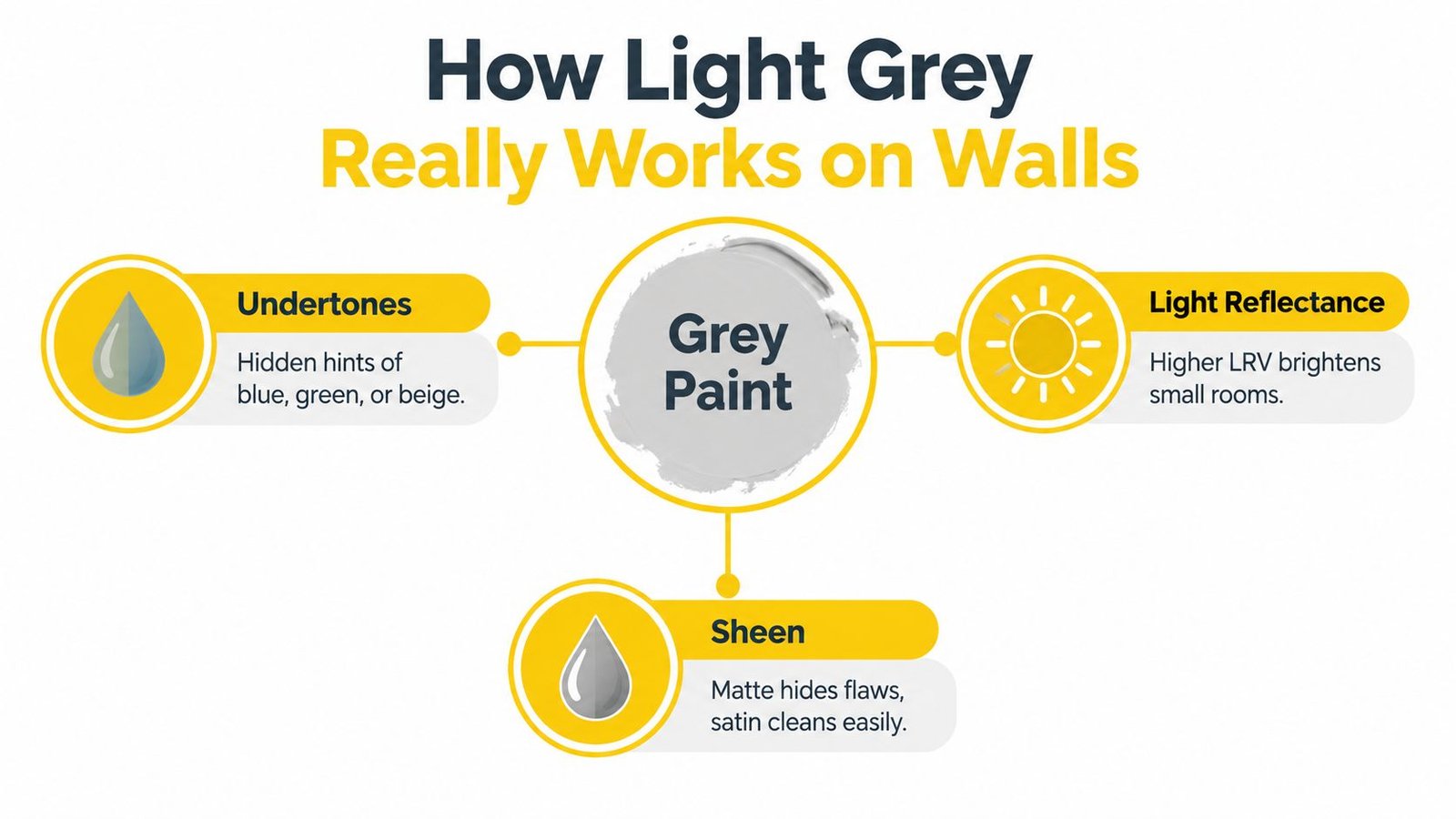
Think of grey like a neutral-coloured fabric woven with a hidden thread. From across the room, the fabric looks grey. Up close, you may notice a blue, green, beige, or violet thread influencing the overall impression. That hidden thread is the undertone.
Light also acts as a second filter. A grey with a warmer base may look soft and welcoming in a north-facing room, while a blue-grey can appear crisp and calm in a bright south-facing space. In a room with warm lamps, beige undertones become easier to notice. Under cooler LEDs, blue undertones can become more visible.
Undertone: the subtle colour beneath the visible grey.
LRV: Light Reflectance Value, a measure used to describe how much light a colour reflects. Higher LRV generally makes a room feel brighter, while a lower LRV can create more visual weight.
LRV matters most when you’re working with a small condo, a narrow hall, or a room with limited daylight. The California Energy Commission’s envelope research uses wall-reflectance cases around 0.25 for medium or dark walls, 0.50 for light walls, and 0.70 for white walls. The technical LRV reference illustrates the middle position light grey often occupies. It can reflect substantially more solar energy than a dark façade while absorbing more than white.
A practical way to judge a grey
Don’t compare a grey only against a white paint card. Place the sample beside your actual trim, floor, countertop, sofa, or cabinet. A grey that looks neutral alone may reveal a blue cast beside warm wood, or a beige cast beside a cool white.
Sheen contributes to the result too. Matte finishes soften glare and help disguise minor wall texture, while a washable satin or low-sheen finish can suit areas that receive more handling. The right choice depends on wall condition, room use, cleaning expectations, and the manufacturer’s product guidance.
For smaller rooms, you may also find Quote My Wall space-saving tips useful when deciding whether wall colour, furniture placement, and visual continuity can make the space feel more open. Before purchasing paint, compare product specifications from trusted brands and review guidance on the best interior paint brands in Canada.
Lighting and Undertones That Change Your Grey
A grey wall doesn’t change its formula during the day. Your eyes receive a different mix of natural and artificial light, and the wall reflects that mix back into the room. This is why a shade can look neutral in the morning, blue at midday, and slightly beige in the evening.
North-facing Toronto rooms are especially important to test carefully. Their daylight can make cool greys appear blue, violet, or steely. A white ceiling and bright trim may intensify that contrast, while a warmer grey with a small beige or taupe influence can prevent the room from feeling flat.
South-facing rooms generally provide a warmer visual environment, so a cool grey may feel more balanced there. East-facing rooms can look different in the morning than later in the day, while west-facing rooms may gain warmth toward evening. The room’s actual use matters. A home office used early in the day needs a different test than a family room used mainly after work.
Test before you commit
Paint a large sample board rather than relying on a small card. Move it around the room so you can see the grey near the window, in a corner, beside the trim, and against the flooring.
Use this checklist:
- Morning: Check whether the grey appears blue, violet, beige, or neutral in early daylight.
- Midday: Look for unwanted glare, dullness, or a washed-out appearance.
- Evening: Turn on the room’s actual lamps and observe how the bulb colour changes the wall.
- Sightlines: Carry the board into the hallway and adjoining rooms to test how the colour connects.
- Furnishings: Place the board beside the sofa, cabinetry, flooring, artwork, and metal finishes.

If the sample looks cold in every part of a shaded condo, move toward a warm greige rather than choosing a lighter version of the same blue-grey. A higher LRV can improve brightness, but it won’t remove an undertone that conflicts with the room.
Toronto homeowners preparing a listing should test the colour with the lighting used for photographs. A grey that looks polished beside natural window light may read differently under ceiling fixtures, so a professional colour check can reduce the risk of repainting before a sale or rental turnover. For more ideas on selecting neutral colours for brighter spaces, review Soca Services’ eight best neutral paint colours for bright rooms.
Comparing Warm Cool and True Neutral Light Greys
Choosing the right grey family is easier when you stop comparing dozens of individual swatches. First decide whether your room needs warmth, crispness, or visual balance. Then sample only a few shades within that family from brands such as Sherwin-Williams or Benjamin Moore.
| Grey Family | Undertone Hint | Best Light and Room Fit | Mood and Pairing Tip |
|---|---|---|---|
| Warm greige | Beige, taupe, or soft brown | North-facing rooms, shaded condos, bedrooms, and spaces with warm wood | Welcoming and forgiving. Pair with cream, oak, linen, aged brass, and soft black. |
| Cool blue-grey | Blue, blue-green, or violet | Bright rooms with abundant daylight, contemporary spaces, and crisp white finishes | Clean and tailored. Pair with bright white, charcoal, glass, chrome, and cooler textiles. |
| Balanced true grey | A restrained mix without an obvious warm or cool pull | Flexible open plans where furnishings and lighting change throughout the day | Calm and adaptable. Pair with both warm wood and black accents, then adjust the mood through textiles. |
Warm greige for low-light homes
Warm greige is often the safer starting point for a north-facing Toronto condo or a hallway with limited daylight. It doesn’t guarantee that the wall will look warm in every condition, but its base can soften the blue cast that makes cool greys feel icy.
This family also works well for resale preparation because it supports common flooring and furnishing materials. Oak, walnut, cream upholstery, natural linen, and aged metal can sit comfortably beside it without creating a sharp temperature clash.
Cool blue-grey for a deliberate look
Cool grey has a place. In a bright Vaughan open-concept home with white cabinetry, strong daylight, and contemporary furnishings, it can create a crisp backdrop. In a darker room, however, the same shade may feel distant or heavy, especially when paired with very cool lighting.
Balanced grey for flexible spaces
True neutral grey suits clients who want a restrained wall colour that won’t dominate changing furnishings. It can work across a connected main floor, particularly when the home has varied exposures and several sightlines. Sample it beside the actual trim and floor, because a supposedly balanced grey can still reveal a subtle lean in your room.
Room by Room Guide to Light Grey Walls
The best light grey isn’t the same for every room. Start with the room’s light and function, then decide how much contrast you want around the walls.
Living rooms and open plans
A living room can handle a balanced grey when daylight changes throughout the day. In a Vaughan or North York open-concept home, carry the same wall colour through connected spaces if the sightlines are strong, then introduce distinction through rugs, furniture, artwork, and lighting.
Use warm wood, textured upholstery, and greenery to keep the room from feeling sterile. If the floor is already cool, avoid pairing it with a strongly blue-grey wall unless you want a deliberately crisp scheme.
Bedrooms and home offices
Bedrooms usually benefit from a quiet, softened grey. A warm greige can make a north-facing bedroom feel less stark, while a balanced grey can provide a calm background for layered bedding.
For a home office, check the wall behind your desk and the area visible on video calls. A restrained grey can look organised without competing with bookshelves or artwork. Soca Services offers further guidance on selecting bedroom wall colours when comfort and lighting need to work together.
Kitchens and bathrooms
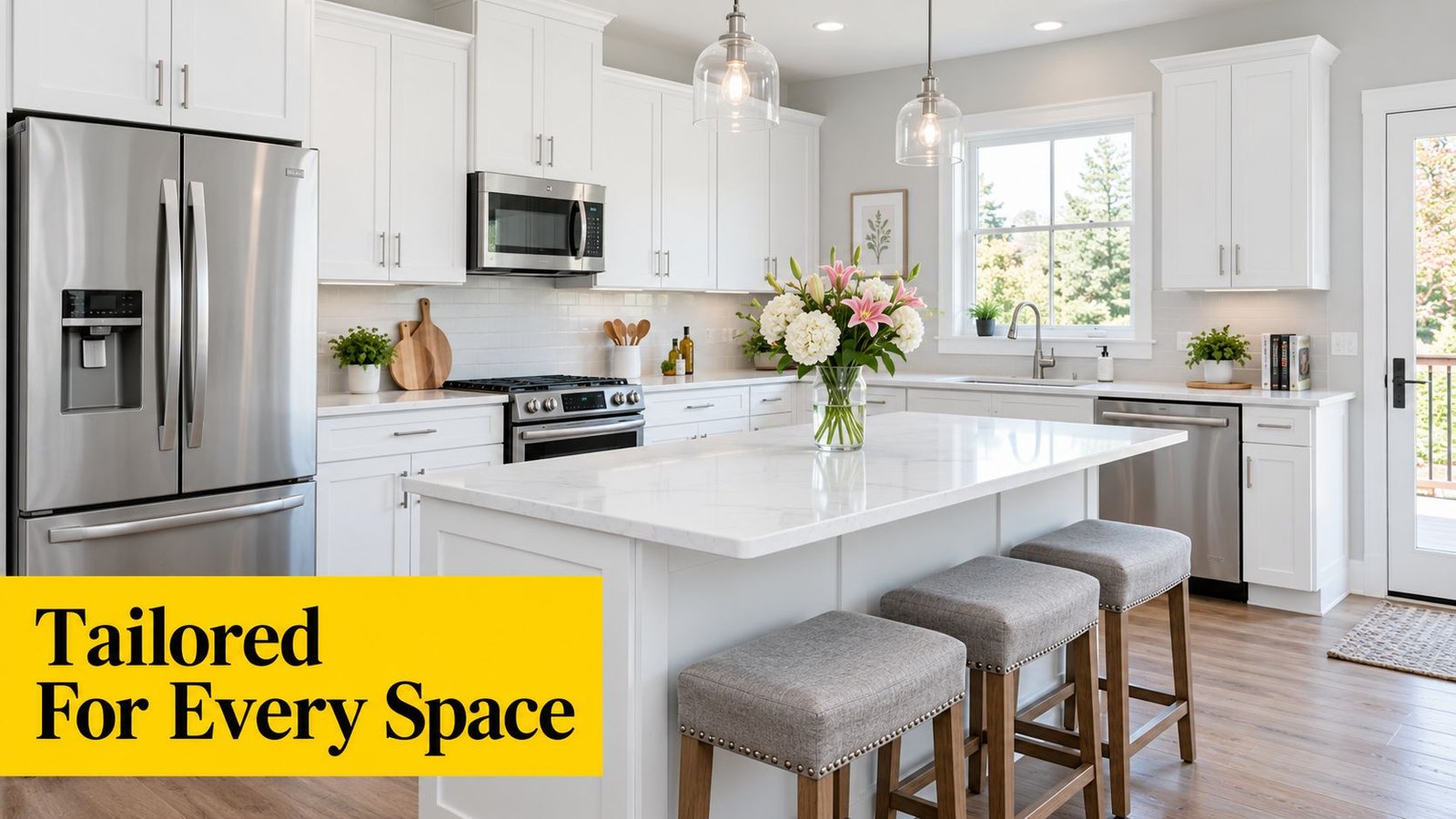
In kitchens, compare the wall sample with cabinet white, countertop veining, backsplash tile, and flooring. A bright modern kitchen can support a cooler grey, while cream cabinetry and natural stone usually favour a warmer option.
Bathrooms need careful sheen selection because condensation and cleaning affect the finish. Coordinate the grey with tile undertones rather than choosing it from the wall colour alone.
Hallways and higher-end finishes
A narrow Toronto condo hallway may need a brighter, balanced grey with enough reflectance to avoid looking enclosed. For King City homes with detailed trim, stone, or custom millwork, a softer grey can highlight craftsmanship without competing with it.
Soca Services Painting provides interior painting for homes and properties in Toronto, Vaughan, North York, and King City, with attention to clean edges, consistent coverage, and the durability required for everyday use.
Designer Palettes and Pairings for Light Grey Walls
A light grey wall becomes much more successful when the rest of the room gives it a clear role. Treat the grey as the background, then decide whether your furnishings should warm it, sharpen it, or create a quiet tonal scheme. Benjamin Moore and Sherwin-Williams collections offer useful inspiration, but the final choice still needs to be tested in your home.
Palette one with warm wood and brass
Choose a light greige with a beige or taupe influence. Use a soft white on trim, natural oak or walnut for furniture, aged brass for hardware, and cream or oatmeal textiles.
This palette suits a north-facing Toronto living room, bedroom, or shaded entry. The wood supplies warmth without demanding a strong wall colour, while brass adds definition. It also photographs comfortably because the room contains variation in texture and temperature rather than one uninterrupted field of grey.
Palette two with crisp white and matte black
Select a balanced or gently cool grey, then pair it with clean white trim, matte black lighting, charcoal upholstery, and restrained artwork. A cooler floor, glass table, or smooth metal detail can reinforce the contemporary character.
This combination works in a bright kitchen, modern condo, or commercial reception area. Keep some tactile materials, such as wool, linen, ribbed glass, or timber, so the room doesn’t become visually hard.
Palette three with green and natural textures
Use a balanced grey with a slight green influence, soft off-white trim, muted sage accents, warm oak, and black or bronze hardware. Layer plants, woven baskets, and natural fabrics to create depth.
This palette is adaptable for bedrooms, home offices, and family rooms. It demonstrates a useful colour principle: the wall doesn’t need to carry all the visual interest. If you enjoy learning how colours relate and combine, this resource on mastering colour mixing in art offers helpful background for thinking about relationships between hues.
For any palette, paint large boards and place them beside the furnishings that will remain. If an image is used on your website or project page, descriptive alt text such as “Soca Services light grey living room walls with warm wood and brass accents” supports accessibility while clearly describing the finished space.
Get a Flawless Light Grey Finish with Soca Services
Colour selection matters, but preparation determines whether the final wall looks intentional. Light grey can reveal dents, patchiness, roller marks, uneven porosity, and inconsistent sheen, especially in strong side light. Cleaning, repairing, sanding, spot-priming, and applying an even finish create the smooth visual field that makes the colour look its best.
Use a simple decision order:
- Identify the grey’s undertone.
- Check how its LRV behaves in the room.
- Test a large board in morning, midday, and evening light.
- Compare the sample with trim, floor, cabinets, and furniture.
- Select the sheen according to wall condition, cleaning needs, and room use.
- Prepare the surface before applying the finish coats.
Product compliance also matters in Canadian homes and workplaces. Canada’s VOC Concentration Limits for Architectural Coatings Regulations specify limits including 100 g/L for flat coatings, 150 g/L for non-flat coatings, and 250 g/L for high-gloss coatings. The federal regulation provides the product limits that should guide selection.
Older properties require extra care. Health Canada states that interior paint in Canada is limited to 0.5% lead by weight under the Hazardous Products Act, and homes built after 1980 generally have little need for concern about lead in interior paint. It also says consumer paint made in Canada or the United States for indoor use after 1992 is virtually lead-free. Health Canada’s lead information should be consulted before disturbing older coatings.
Health Canada also reports that surface-coating regulations reduced total lead content in certain consumer coatings from 600 mg/kg to 90 mg/kg. The lead risk-management material is relevant to renovation planning, especially in older Toronto-area properties. For homes built after 1990, Health Canada says consumer paints produced in Canada and the United States were virtually lead-free by that time. Its home-safety guidance offers a practical screening point, but testing and safe work practices remain important where existing coatings are uncertain.
Soca Services Painting can prepare and paint interior walls for homeowners, real estate clients, property managers, contractors, renovation companies, and commercial owners across Toronto, Vaughan, North York, and King City. The company can also help coordinate sampling, surface preparation, primer selection, and a durable finish suited to the property’s use. Review guidance on the best paint primer for walls before starting a repaint.
Contact Soca Services Painting for professional light grey wall sampling, preparation, and interior painting in Toronto, Vaughan, North York, and King City. Get a free estimate for a finish that stays coordinated with your lighting, furnishings, and resale or rental goals, then visit Soca Services Painting to learn more and arrange your project.