
You've found a bedroom colour that looks perfect on a small sample, then painted it on the wall and watched it change under northern exposure, evening bulbs, or limited daylight. That's common in Toronto-area homes, especially condos and compact bedrooms where every surface reflects the available light. The right bedroom wall colours depend on the mood you want, the room's exposure, the colour's undertone, your furniture, the size of the space, and the condition of the walls.
This guide covers seven palettes, from warm whites and beige to slate blue, sage, terracotta, blush, and dusty lavender. Test samples on more than one wall and view them in daylight, at dusk, and under the lamps you regularly use. The Woodstock Furniture & Mattress Outlet palette tips can also help you compare furniture and colour combinations before committing.
For an even result, Soca Services provides professional interior painting in Toronto, Vaughan, North York, and King City, with careful preparation, clean cutting, and durable finishes designed for real homes, rentals, renovations, and commercial properties.
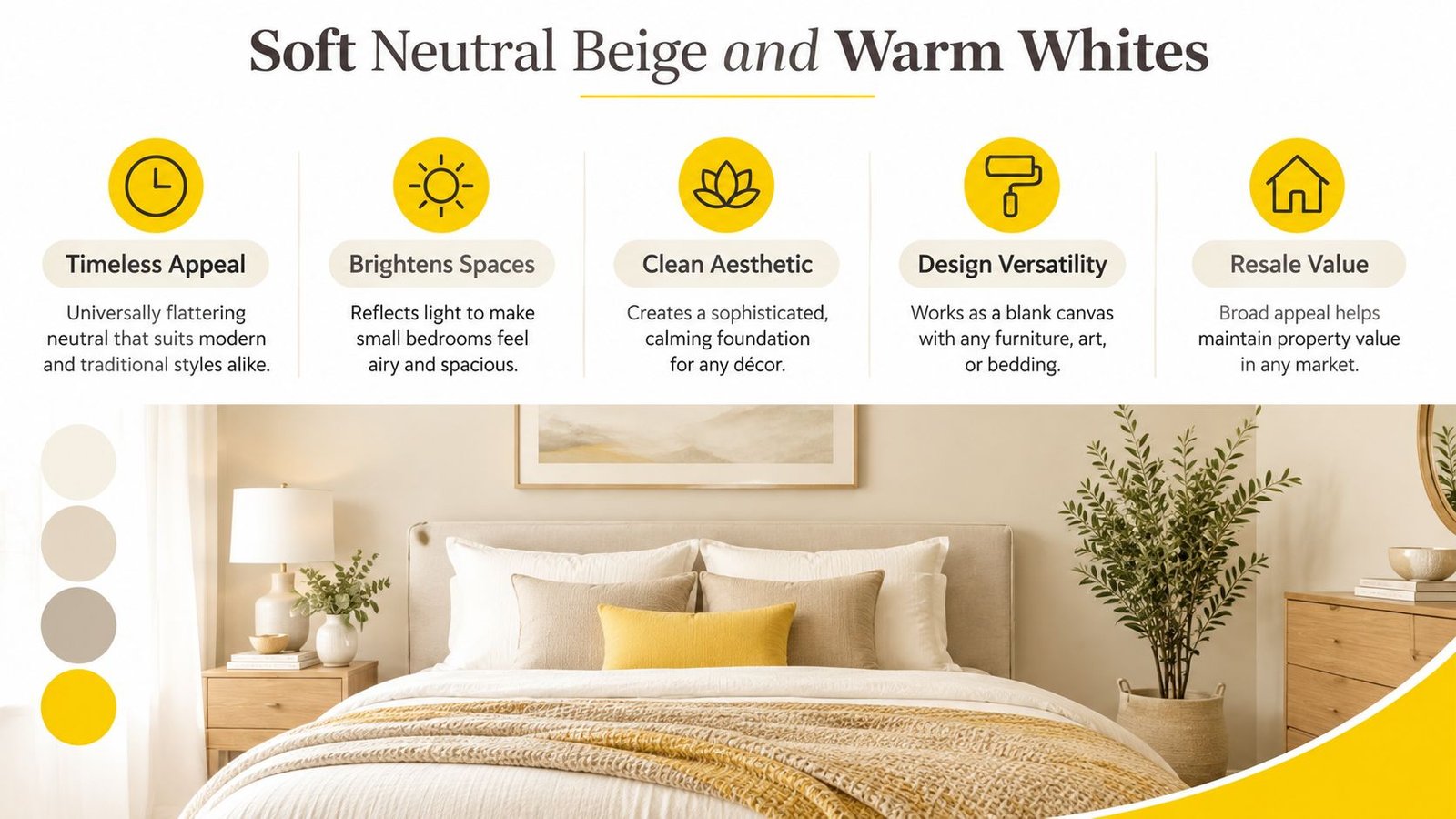
1. Soft Neutral Beige and Warm Whites
Soft beige, cream, and warm white create one of the most flexible bedroom foundations. They keep a room feeling open without the starkness that some cool whites can produce, and they work with wood furniture, upholstered beds, modern décor, and traditional trim. For a Toronto condominium with limited daylight, a warm neutral can reflect available light while still giving the room a comfortable, settled character.
Popular examples include Benjamin Moore Swiss Coffee in luxury Toronto condominiums, Sherwin-Williams Alabaster in contemporary Vaughan homes, and Pantone-approved Accessible Beige in upscale bedroom renovations. Treat those names as starting points, not guarantees. The same colour can appear creamier beside bright white trim and more taupe beside natural oak flooring.
Make neutral walls look intentional
Neutral walls need contrast and texture so they don't look unfinished. Linen bedding, timber frames, woven lampshades, and a slightly deeper neutral behind the bed can add dimension without disturbing the calm palette. A matte finish offers a softer, low-reflective appearance, while eggshell gives modest durability and is easier to wipe in busy households.
- Check the undertone: Beige with pink, yellow, or green influence can react differently to flooring and upholstery.
- Warm the lighting: Soft lighting fixtures and warm-toned bulbs help prevent white walls from feeling flat at night.
- Coordinate the trim: A professional painter can recommend a complementary trim colour instead of defaulting to the brightest white.
For further inspiration, compare these suggestions with neutral paint colours for bright rooms. Soca Services can also assess patching, previous sheen, and uneven absorption before applying the new colour, which matters when a pale finish needs to look consistent across every wall.
2. Soothing Blue and Slate Tones
Blue gives a bedroom a quiet, retreat-like atmosphere, but the best shade depends heavily on exposure. Light blue can feel airy beside white bedding, while slate and navy create a deeper, more enveloping effect in a larger room. A Berkeley study on colour preference found that people preferred cool hues over warm ones when judging colours as wall colours, with blue shades standing out as especially preferred. The paper also found that the preference pattern for interior-room walls resembled broader colour preferences in its wall-context research.
Examples include Benjamin Moore October Mist in North York luxury residences, Sherwin-Williams Naval in contemporary King City homes, and Farrow & Ball Parma Gray, a blue-undertone grey, in high-end Toronto properties. North-facing rooms can make blue appear cooler, so pair it with warm oak, brass, cream textiles, or a warmer white ceiling.
Test blue before choosing the finish
Blue can shift noticeably between morning, afternoon, and lamplight. Paint a generous sample, or use a large removable sample board, and move it around the room. A matte finish can give slate blue more visual depth, while a washable eggshell may suit a rental, children's room, or bedroom that receives frequent contact.
Practical rule: If the room already has cool flooring and cool bulbs, avoid choosing a blue that adds another layer of coldness.
Warm layered lighting usually makes blue more comfortable after dark. For guidance on sheen and room-specific durability, review this advice on the best interior paint finish for living rooms, then apply the same finish logic to your bedroom walls.
The video below offers another visual reference for comparing bedroom colour and atmosphere.
3. Elegant Soft Gray
Soft grey still works in bedrooms when it has the right undertone. A taupe-leaning grey can bridge beige and blue, giving condos, suburban homes, and commercial guest spaces a restrained contemporary look. A blue-leaning grey, however, may feel chilly in a north-facing Toronto room, particularly when paired with bright white trim and cool flooring.
Examples include Sherwin-Williams Urbane Gray in downtown lofts, Benjamin Moore Revere Pewter in property renovations, and Farrow & Ball Cornforth White in upscale bedrooms. Don't judge a grey from a small colour card alone. View the sample beside the floor, headboard, curtains, and trim because nearby surfaces can pull out undertones that aren't obvious in isolation.
Give the sample enough time
Live with the sample for at least a full day and compare it across changing conditions. Morning daylight may reveal beige, while evening lamps may make the same wall read warmer or deeper. Toronto-focused coverage describes a move from the cold greys associated with the 2010s toward warmer whites, greige, and darker accents in Toronto homes for current trend context.
Use warm wood flooring, brass, copper, terracotta accessories, or oatmeal-coloured bedding to keep soft grey from becoming sterile. Layered lighting also helps, especially when the room has one central fixture and limited window light.
A consistent grey finish starts with consistent preparation. Repairs, sanding, dust removal, and suitable primer can affect how evenly the colour develops, so use this wall preparation guide before you estimate the paint quantity or choose the final sheen. Soca Services can identify patched areas, visible roller texture, and old glossy coatings that may otherwise show through a new neutral.
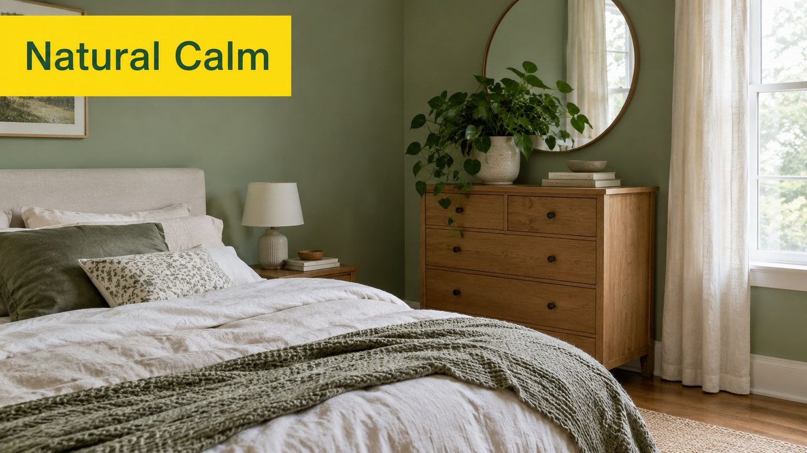
4. Warm Sage Green and Muted Olive
Warm sage and muted olive bring a grounded, nature-inspired quality to a bedroom without the intensity of a saturated green. Canada-focused colour guidance for projected 2026 demand identifies muted greens among the leading colour families, with lighter greens increasingly appearing in bedrooms in the cited Canadian paint-industry coverage. The practical appeal is clear in Toronto homes. Sage can feel restful, but it also adds more personality than a standard beige.
Examples include Sherwin-Williams Sea Salt in contemporary homes, Benjamin Moore HC-126 Gettysburg Gray with its green influence in renovations, and Farrow & Ball Blue Gray with a sage quality in luxury properties. Test each shade against your flooring because yellow oak, red-toned wood, and cool laminate can all change how green appears.
Keep green warm and balanced
Choose a sage with golden, grey, or earthy influence rather than a sharp blue cast if the room receives limited winter light. Warm lamps, natural wood, brass, copper, and neutral linens help the colour feel settled. Botanical art or live plants can reinforce the palette, but don't fill every surface with green. A restrained combination usually looks more polished.
For Toronto condos and smaller primary bedrooms, use lighter sage on all walls or reserve a deeper olive for the wall behind the bed. In a larger King City bedroom, a richer muted olive can support darker wood furniture and layered textiles without feeling crowded.
Benjamin Moore's Canadian colour guidance associates light green and blue with relaxation in its colour psychology overview. That doesn't remove the need to test samples, but it supports using softer versions when the bedroom needs a calmer visual effect.
5. Warm Terracotta and Rust Accent Walls
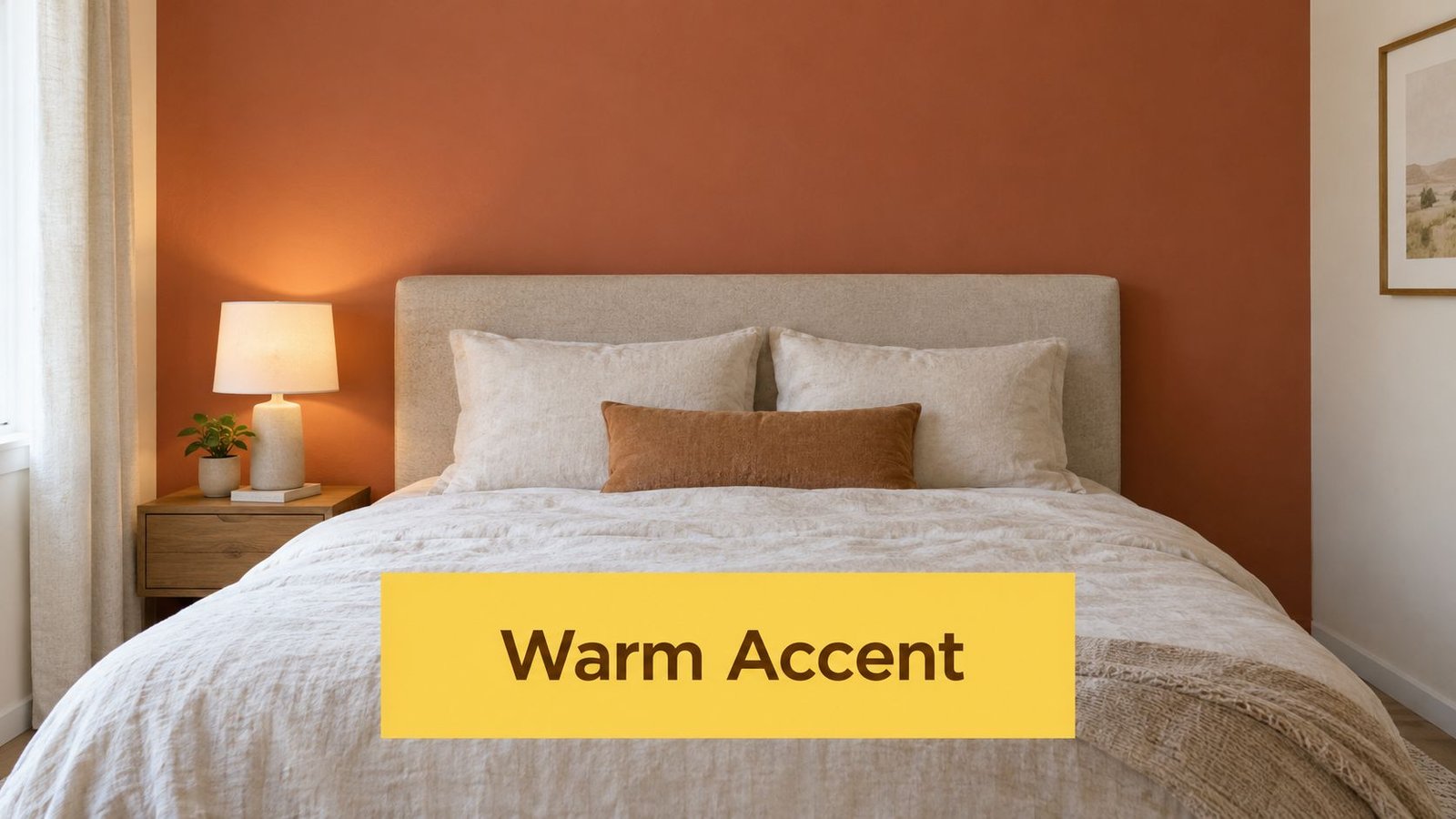
Terracotta and rust add clay-like warmth, making a bedroom feel more intimate and collected. They usually work best as an accent rather than a full-room colour, especially in a compact North York bedroom or a condo with limited daylight. A muted rust wall behind the bed can anchor the furniture and create a clear focal point without making every wall compete for attention.
Examples include Sherwin-Williams Borscht as a bedroom accent, Benjamin Moore October Mist paired with a rust feature wall, and Pantone Dried Herb in upscale master-bedroom renovations. These combinations work because the surrounding walls stay quiet. Warm white, soft beige, or light greige on the remaining walls gives the accent room to breathe.
Place the accent where the room rests
The wall behind the bed is generally the most effective location because it supports the room's natural focal point. Avoid placing a strong rust colour on several disconnected walls unless the bedroom is spacious and receives generous light. In a smaller room, repetition through cushions, artwork, or a throw is often enough.
- Choose muted clay: Bright orange can feel active rather than restful.
- Use warm illumination: Edison-style bulbs or warm-toned LED lighting can support the earthy palette.
- Prime carefully: Uneven porosity can make a rich colour look patchy, particularly over repaired drywall.
- Select the sheen deliberately: Matte gives a quiet, depth-enhancing look, while eggshell offers easier cleaning.
Canada-focused trend coverage identifies warmer neutrals, clay, greige, and quiet jewel tones as alternatives to the cool whites and greys that dominated earlier decorating cycles in its 2025 trend discussion. For a clean transition and sharp corners, follow this guide to painting an accent wall perfectly. Soca Services can handle the line where the feature colour meets the surrounding neutral, trim, ceiling, and baseboards.
6. Soft Blush Pink and Mauve
Blush and mauve create a romantic bedroom with a mature, contemporary feel when the colour is dusty and muted. Look for grey, beige, or brown undertones that work with the furniture, flooring, and trim. Benjamin Moore Ballet White with a pink influence can suit a condo palette, while Sherwin-Williams Blustery Sky with a mauve character and Farrow & Ball Cinder Rose offer deeper options for a primary bedroom.
Exposure changes the result. Strong afternoon sun can make blush appear warmer and more saturated, while cool bulbs may sharpen the colour and reduce its softness. Paint a sample beside the headboard and flooring, then review it in daylight and under the lamps used before bed. A full-room application suits a light, balanced shade. A deeper mauve can work well behind the bed as an accent wall, especially in a smaller bedroom.
Build a mature blush palette
Warm metals, natural wood, cream bedding, and modern artwork keep blush refined. Walnut furniture and charcoal accents give mauve stronger contrast. Avoid using several competing pink tones across the walls, textiles, and accessories, since the room can quickly feel juvenile.
Surface preparation matters with pale, muted colours. High-quality paint and a sound primer help prevent repaired drywall and uneven porosity from showing through. Sand patches smooth, spot-prime repairs, and maintain a consistent application so the colour reads as intentional rather than diluted.
For occupied homes, rental turnovers, and managed properties, confirm the product's emissions and ventilation requirements before painting. Read what VOC in paint means before choosing a low-emission coating. Canadian federal rules set interior architectural coating limits at 100 g/L for flat coatings, 150 g/L for non-flat coatings, and 250 g/L for high-gloss coatings, as summarized in a summary of Toronto low-VOC paint regulations and limits.
A polished blush room needs restraint. Let the wall supply the colour, then use timber, linen, and warm metal to supply the character.
Choose matte for a soft, quiet appearance, or eggshell where easier cleaning matters. Soca Services can match Benjamin Moore, Sherwin-Williams, or another premium paint to the existing surfaces and selected finish, producing even coverage across corners, repaired areas, and wall transitions.
7. Soft Lavender and Dusty Purple
Soft lavender and dusty purple offer personality without the visual force of a saturated violet. They suit bedrooms where the owner wants something more distinctive than a neutral while still maintaining a quiet atmosphere. The best versions look softened by grey, beige, or a smoky blue influence. Bright purple usually demands more attention and can overwhelm a small room.
Examples include Benjamin Moore October Mist with a lavender influence in renovations, Sherwin-Williams Potentially Purple in master bedrooms, and Farrow & Ball Cooks Blue with a purple undertone in luxury properties. These names demonstrate how undertones can overlap across colour families. Always compare the actual sample with your trim and furnishings rather than relying on the label.
Prevent lavender from feeling cold
Warm white trim, linen, pale timber, and neutral upholstery create a balanced backdrop. Warm lighting can bring out the colour's comfortable side, while cool bulbs may make it appear sharper or more blue. A matte finish can make dusty purple feel soft and refined, whereas eggshell may be more practical for walls exposed to frequent touching.
Use lavender as a full-room colour when the shade is light and the room has reasonable daylight. For a darker purple, an accent wall behind the bed is the safer decision. Avoid pairing it with multiple pink tones because the combination can appear overly youthful. Natural textures, including woven materials and wood, add enough contrast to keep the palette grown-up.
For Toronto, Vaughan, North York, and King City properties, surface condition still controls the final appearance. Filling dents, sanding ridges, caulking gaps, and applying primer where needed will help a delicate colour look uniform. A professional crew also protects flooring and furnishings, cuts cleanly around trim, and maintains a consistent roller texture across the wall.
7-Way Bedroom Wall Color Comparison
| Style | 🔄 Implementation Complexity | ⚡ Resource Requirements | 📊 Expected Outcomes | 💡 Ideal Use Cases | ⭐ Key Advantages |
|---|---|---|---|---|---|
| Soft Neutral Beige & Warm Whites, calming, airy foundation | Low, simple application; accent/trim selection may need care | Low, standard paints; basic lighting tweaks; painter optional | Bright, spacious, spa-like calm; broad market appeal | Master & guest bedrooms; resale-targeted properties | Timeless, easy to coordinate, increases perceived space |
| Soothing Blue & Slate Tones, tranquil, sleep-promoting blues | Medium, undertone testing critical; lighting-sensitive | Medium, multiple samples; warm-layered lighting; color consult useful | Promotes relaxation and better sleep; can feel cold or smaller in dark shades | Master bedrooms, anxiety-prone users, north-facing rooms | Scientifically linked to improved sleep; sophisticated in deeper shades |
| Elegant Soft Gray, modern, balanced neutral | Medium, undertone selection (taupe vs. cool) is crucial | Medium, sample testing; primer and layered lighting recommended | Contemporary, professional backdrop; raises perceived value when done right | Modern renovations, condos, commercial spaces | Versatile with warm/cool accents; hides imperfections; trendy yet timeless |
| Warm Sage Green & Muted Olive, nature-inspired calm | Medium, choose warm vs. cool undertone carefully | Medium, quality paints, warm lighting, decor coordination; pro help advised | Grounded, wellness-focused atmosphere; can be trendy or murky if mis‑chosen | Wellness-focused bedrooms, nature-inspired schemes | Connects to nature, pairs with wood/stone, distinctive in listings |
| Warm Terracotta & Rust Accent Walls, rich, earthy focal | Medium–High, best as a single feature wall; precision required | Medium, primer, muted tones, warm lighting, skilled application recommended | Creates strong focal point and warmth; can overwhelm small/poorly lit rooms | Accent behind bed, master bedrooms, luxury renovations | Dramatic visual interest; complements warm metals and natural materials |
| Soft Blush Pink & Mauve, romantic, sophisticated tones | Medium, subtle tone selection to avoid dated or juvenile looks | Medium, high-quality paint, layered warm lighting, coordinated decor | Romantic, memorable, upscale feel; may narrow broad-market appeal | Luxury master bedrooms, owners seeking distinctive design | Distinctive and elegant; pairs beautifully with brass/rose gold |
| Soft Lavender & Dusty Purple, calming with creative edge | Medium, choose muted/dusty tones; coordinate carefully | Medium, sample testing; warm lighting; neutral furnishings advised | Calming and creative ambiance; niche appeal and trend risk | Creative individuals, relaxation-focused bedrooms, unique homes | Offers restful yet inspiring mood; pairs well with neutrals and grays |
Turn Your Colour Choice Into a Lasting Finish
The best bedroom wall colour is the one that still works after the room's real lighting, furniture, and daily use enter the picture. Start by sampling the shortlist directly in the bedroom. View each option near the window, beside the headboard, and on a wall that receives less light. Check it in natural daylight, at dusk, and under the lamps you use at night. A colour that looks balanced in the afternoon can become noticeably cooler or warmer after dark.
Confirm the undertone before ordering paint. Beige can lean pink, yellow, or green. Grey can move toward blue or taupe. Sage can look earthy or icy. Blush can read beige in one room and distinctly pink in another. Compare the sample against flooring, curtains, trim, cabinetry, and larger furniture pieces rather than judging it against a white card.
Then select the finish based on both appearance and wall condition. Matte hides minor surface variation and gives a soft, low-reflective look, but eggshell can be a practical choice where the walls need easier cleaning. A higher sheen won't correct poor preparation. It can make dents, sanding marks, roller lines, and uneven patches more visible.
Toronto-area properties also benefit from choosing products responsibly for the room and its occupants. Canadian federal VOC limits for architectural coatings apply to interior products, so homeowners, property managers, and commercial clients should discuss the product and ventilation plan with their painter before work begins.
Professional preparation makes the chosen colour look consistent. Soca Services can address cracks, nail holes, old sheen, drywall repairs, and adhesion concerns before applying primer and finish coats. Precise cutting around ceilings, doors, baseboards, and windows keeps the palette crisp, while controlled application helps prevent flashing and uneven texture.
Whether you're refreshing a condo in Toronto, preparing a rental in Vaughan, updating a North York home, or completing a King City renovation, the right colour deserves a proper finish. You can also coordinate the completed walls with contemporary wall decor and canvas prints once the paint has cured and the furniture returns.
Contact Soca Services for bedroom and interior painting, or get a free estimate for your property. You can also learn more on the website about colour consultation, preparation, durable finishes, and professional painting services designed for homeowners, property managers, contractors, renovation companies, and commercial clients.
Soca Services Painting provides interior painting and colour consultation for bedroom walls in Toronto, Vaughan, North York, and King City. Visit Soca Services Painting to discuss your palette, surface preparation, and finish, then arrange a free estimate for a clean, durable result.