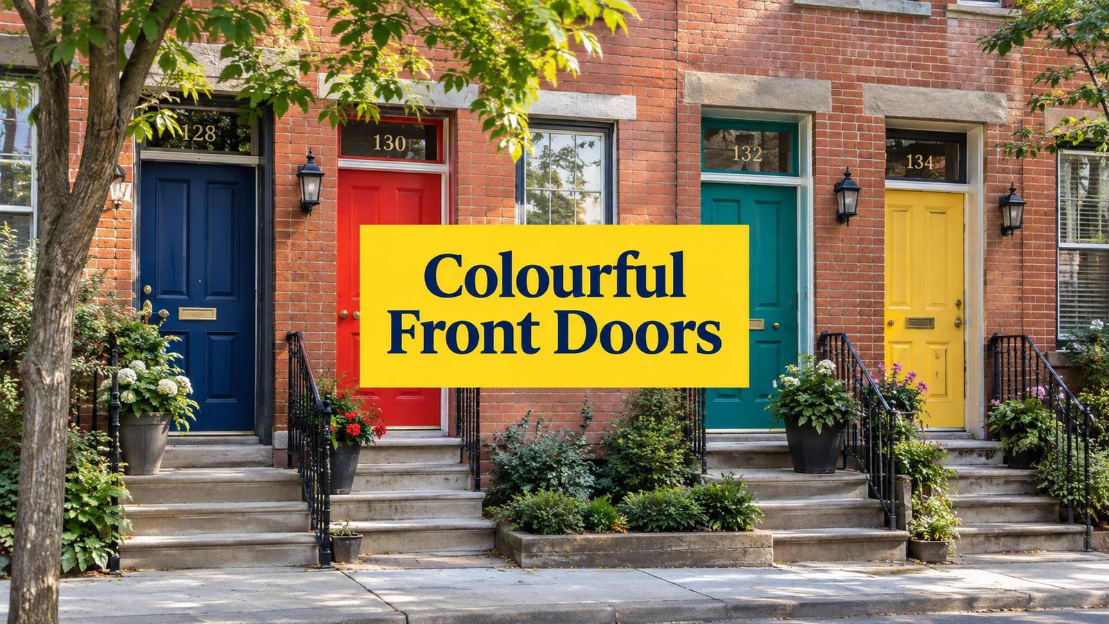
A colourful front door can refresh a Toronto home's curb appeal without repainting the entire exterior. More than a style detail, the entry colour influences how buyers read the architecture, how guests experience the arrival, and how confidently a homeowner can present the property.
One widely cited Zillow paint-colour study found that buyers associated a black front door with about $6,449 in additional perceived resale value, while a pale pink door was associated with about $6,516 less. Slate blue was linked with about $1,537, and mid-toned brown with about $300. Read the cited front-door colour findings. Those figures don't make colour a guarantee, but they do show why a carefully chosen door can be a worthwhile part of a larger presentation strategy.
The eight examples below connect colour with mood, brick, siding, daylight, trim, hardware, finish, maintenance, and neighbourhood context. You'll find ideas suited to traditional Toronto homes, Vaughan luxury properties, North York offices, and King City residences, along with practical cautions about bold colours and Toronto-area weather. For professional colour consultation, preparation, and durable exterior application, contact Soca Services for a free estimate. Homeowners considering international inspiration can also compare approaches in this guide to Auckland homeowner front door colours.
1. Bold Navy Blue
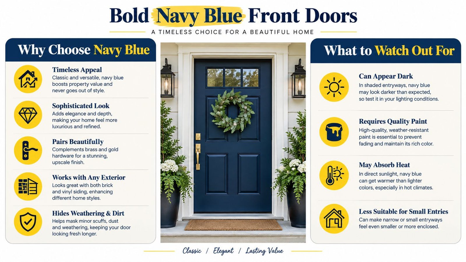
Navy blue gives a front door presence without the severity of true black. It conveys confidence and stability while retaining enough colour to sit comfortably beside brick, stone, or pale siding. That balance suits a Vaughan luxury development, a North York professional office, or a traditional Toronto home needing a refined update.
Red brick calls for a navy with enough depth to remain distinct from warm undertones. Against light grey, cream, or white siding, navy becomes a crisp focal point. Benjamin Moore and Sherwin-Williams offer durable exterior products in deep blue families, but sample the colour directly on the door rather than relying on a small card.
Practical rule: Check the sample in morning, noon, and evening light. Ontario guidance stresses that brick, siding, trim, and daylight can change how the same blue appears. See Ontario front-door colour sampling guidance.
Make navy look intentional
White or cream trim creates strong definition. Brass or brushed-gold hardware adds a polished traditional note, while brushed nickel suits homes with cool grey stone, contemporary lighting, or stainless-steel details. Entry lighting also affects the result. Without enough light, navy can read almost black after sunset.
A satin or semi-gloss finish usually suits navy. It reveals the colour's depth, reflects some available light, and cleans more easily than a very flat coating. The sheen also makes surface flaws more visible, so preparation must be careful.
Clean the door, sand sound existing paint, spot-prime exposed areas, and mask glass, weatherstripping, and hardware. Follow Soca Services' practical guide to painting an exterior door before applying the finish coats. On Toronto-area entrances, pay particular attention to edges and lower sections that receive moisture, salt, and repeated contact.
2. Vibrant Red
Red works when the entry needs energy. A traditional red can make a white-painted Toronto home feel welcoming, while burnt red or clay-red can give a contemporary renovation a more grounded appearance. The colour has enough visual force to stand out from the street, so the surrounding porch, planters, and trim should stay controlled rather than competing for attention.
A boutique storefront in a lively Toronto neighbourhood might use a clear red to signal approachability. A King City or North York home may benefit from a darker red that sits comfortably beside stone, dark roofing, or natural wood. The right shade depends on the exterior palette. A cool red beside blue-grey siding can look sharper, while a warm red belongs more naturally with cream trim, brown stone, or warm brick.
Control the intensity
Bright red isn't automatically better. Highly saturated colour can dominate a small porch, particularly when direct sunlight hits the door. A deeper red often provides the same welcoming effect with a more settled appearance. Benjamin Moore Red Door and Sherwin-Williams Positive Red are useful starting points, but samples should be viewed beside the actual casing and masonry.
Use satin or semi-gloss to support cleanability and colour richness. Black or dark-grey hardware creates a modern combination, while aged brass makes the door feel more traditional. Keep landscaping simple, especially if the property already has strong brick patterning or colourful seasonal plants.
The Canadian real-estate commentary cited by 180 Transformations says a 2024 Canadian Real Estate Association summary reported that homes with strong curb appeal sold for an average of 7% more than similar homes in the same neighbourhood. Read the Canadian curb-appeal commentary. A red door won't create that result by itself, but a clean, well-prepared entry can support the broader first impression.
For more coordinated exterior palettes, explore Soca Services' recommendations for exterior paint colour combinations.
3. Elegant Forest Green
Forest green brings a natural mood to the entrance while remaining formal enough for a high-end property. It works especially well on red-brick homes in Rosedale, Forest Hill, and established parts of Toronto because the green offsets the brick's warmth without fighting its texture. Natural wood, stone steps, and mature planting strengthen the connection.
The main risk is green-on-green. If the door sits behind dense shrubs or beside a heavily planted garden, a very dark green may disappear. A lighter trim, a warm porch light, or a contrasting threshold can give the entry enough separation. On a Vaughan property with restrained landscaping, forest green can become the architectural centre instead.
Match depth to the façade
Benjamin Moore HC-133 Dark Hunter Green and Sherwin-Williams Evergreen Fog SW 9130 offer useful reference points, although their appearance will change with the door material and exposure. A deep green beside cream trim feels traditional. The same colour with black trim and simple metal hardware reads more contemporary.
Semi-gloss is a strong choice because it shows the richness of the pigment and allows the surface to be wiped clean. Black or oil-rubbed bronze hardware keeps the look quiet and architectural. Brass can work too, but it adds more formality and should relate to other entry details.
Toronto's freeze-thaw conditions make preparation especially important. Toronto exterior-painting guidance explains that temperatures fluctuating around freezing can allow moisture to expand and contract in wood and masonry, which may crack paint and damage surfaces when protection and preparation are inadequate. A professional application should address failing caulk, exposed substrate, loose coating, and water entry before colour goes on.
4. Sunny Yellow
Yellow creates an immediate sense of warmth, but it needs careful calibration. A soft buttery yellow can suit a cottage-style Toronto home, while a richer golden shade can complement a North York modern farmhouse renovation. Boutique commercial spaces may use a brighter yellow to make the entrance easier to identify, but residential doors usually benefit from a slightly muted tone.
Avoid choosing yellow in isolation. Place the sample beside the siding, brick, porch floor, and trim. Grey siding can make yellow appear warmer, while red brick may intensify its orange side. If the porch receives strong afternoon sun, the colour can look more vivid than expected.
Use contrast without visual noise
Benjamin Moore HC-5 Daffodil and HC-11 Golden Gate are practical reference colours for a more considered yellow. Black or dark-brown hardware gives the door structure, while white trim can make the whole entrance feel brighter. A semi-gloss finish supports easy cleaning and gives the colour enough reflection to avoid looking dull.
Keep nearby accessories restrained. One dark planter, a simple light fixture, or a plain doormat will usually frame the door better than several competing colours. This matters on smaller urban porches where every object sits close to the entry.
A colourful door should lead the composition, not compete with every other feature on the porch.
Toronto-area homeowners should also consider maintenance. Exterior paint in Southern Ontario commonly lasts 5 to 10 years, with wood siding and trim often lasting 5 to 7 years, stucco and masonry 7 to 10 years, fibre cement 8 to 10 years, and painted brick 10 years or more when moisture is well managed. Review Southern Ontario exterior-paint longevity guidance. The door may need attention sooner if it receives heavy use, road salt, or direct sunlight.

The following visual offers another way to assess how a brighter entry colour can work with a neutral exterior.
5. Modern Charcoal Gray
Charcoal grey is a useful middle ground for homeowners who want a modern door without the intensity of black. It has enough contrast to define the entrance, yet it usually sits comfortably with brick, siding, stucco, concrete, and stone. That flexibility makes it suitable for Vaughan infill homes, North York offices, and contemporary Toronto properties.
The critical choice is undertone. A charcoal with blue undertones can look clean beside cool grey siding but disconnected from warm beige stone. A warmer charcoal can support taupe, brown brick, and natural wood. Compare the sample beside the largest fixed exterior surfaces, not just the trim.
Keep the palette balanced
Benjamin Moore HC-172 Nimbus Gray, HC-174 Iron Gate Gray, and Sherwin-Williams Urbane Gray SW 7032 can help narrow the direction. The final selection should account for the door's exposure and the amount of surrounding grey. If the façade already contains extensive grey, a charcoal door may need warm brass hardware or wood accents to prevent the entry from feeling flat.
Satin creates a softer contemporary appearance. Semi-gloss gives more reflectivity and makes fingerprints easier to remove, which can be useful on a frequently used commercial or shared residential entrance. Either finish demands sound preparation. Grey will not hide peeling edges, dents, or uneven patches, especially when a porch light strikes the door from the side.
Use stainless steel for a crisp commercial look, or matte black for a quieter residential finish. A restrained house number and a simple light fixture will keep the charcoal door looking deliberate rather than unfinished.
For detailed work around the entry, including the casing and adjacent trim, review Soca Services' service information on painting trim and doors. A consistent edge between door, frame, and wall often matters as much as the colour itself.
6. Dramatic Black
Black is the strongest choice in this list for contrast and architectural definition. It can sharpen a pale stucco façade, anchor a modern glass entry, or give a Toronto brick home the formal appearance associated with luxury design. In Rosedale, Yorkville, and King City, a black door can look especially effective when the property already has disciplined lines and high-quality exterior details.
The best black doors have context. Brass, gold, or stainless-steel hardware adds a clear point of finish, while planters or lighting soften the transition between the dark door and the rest of the façade. On a narrow, shaded porch, black may feel heavy unless the trim or lighting provides enough relief.
Treat dark colour as a surface decision
Benjamin Moore Black Onyx HC-174 and Sherwin-Williams Tricorn Black SW 6258 are useful starting points for a true black. Satin or semi-gloss helps the door read as a finished architectural element rather than a flat opening. It also makes cleaning easier, although a higher sheen can reveal dents, brush marks, and uneven substrate more clearly.
Sun exposure deserves attention. A dark-coloured exterior can absorb 70% to 90% of sunlight, compared with 10% to 35% for a lighter tone, according to Canadian guidance on colour and heat absorption. On a sun-facing Toronto door, that heat can increase thermal stress, so the coating system, door material, and manufacturer guidance all matter.
Soca Services' information on the best exterior paint for Toronto weather can help homeowners think through product selection and exposure before committing to black. The colour is timeless, but it isn't maintenance-free. Clean the surface gently, address failed sealant promptly, and inspect the finish after winter.
7. Warm Terracotta
Terracotta gives a front door warmth that cooler blues and greys can't provide. Its clay-like character suits Mediterranean-inspired homes, stucco façades, warm stone, and contemporary properties that use beige, cream, or brown as their main exterior colours. In Toronto's diverse neighbourhoods, it can also bring personality to a creative renovation without looking as sharp as pure orange.
The colour needs a warm setting. Beside blue-grey siding, terracotta may appear unexpectedly orange. Beside red brick, it can either blend beautifully or become too similar, depending on the brick's undertones. Test a generous sample and view it against the full façade before ordering paint.
Build a warm entry
Benjamin Moore HC-18 Terracotta and HC-25 Caliente, along with Sherwin-Williams Pottery SW 7729, provide useful directions. Semi-gloss brings out the earthy depth and supports routine cleaning. Wrought iron, aged copper, and dark bronze hardware reinforce the Mediterranean influence, while simple black hardware can make the same colour feel more contemporary.
Use planting to support the palette rather than repeat it exactly. Green foliage, pale grasses, and natural wood can frame terracotta without creating a themed effect. A warm porch light will deepen the colour in the evening, so check the sample after dark as well as in daylight.
Painted brick requires a separate preparation approach from a wood or fibreglass door. The masonry must be sound, clean, and free from moisture problems before coating. For work involving the larger façade, consult Soca Services' guidance on painting exterior brickwork. A well-painted terracotta door looks expressive. A door applied over damp or unstable material won't remain attractive for long.
8. Deep Purple
Purple suits homeowners who want an entrance that communicates creativity and individuality. Shades from restrained aubergine to deep eggplant can suit a Toronto artist's home, a progressive luxury property, or a modern boutique commercial space. Deeper purples usually feel more architectural and mature than pale lavender.
Purple depends on its surrounding finishes. Gold adds glamour, brushed nickel keeps the entry contemporary, and black hardware gives the door a sharper graphic edge. Keep the trim simple so the door remains the focal point. On Toronto homes, the façade material and porch exposure matter just as much as the colour itself.
Choose the right kind of bold
Benjamin Moore 2067-40 Royal Orchard and 2068-50 Regal Purple are useful starting points for a richer colour family. Test a large sample beside the exterior materials. Red brick can make purple appear warmer, while cool siding may push it toward blue. A heavily shaded porch can make an extremely dark purple read nearly black.
Semi-gloss emphasizes depth and makes the surface easier to clean. Proper sanding and priming matter especially when covering an existing dark, glossy, or strongly contrasting colour. Depending on the door's condition, preparation may require adhesion primer, stain-blocking primer, or repairs before the finish coats. A painting professional can assess that before application.
Choose the finish with weather exposure in mind. A sun-facing entrance may show fading sooner, while a protected north-facing door may keep its colour longer but appear darker. Check the sample in daylight and shade before committing.
Purple may narrow resale appeal compared with deep navy, forest green, charcoal, or black. For homeowners planning to stay, however, a well-prepared purple door can create a memorable arrival when the architecture supports a distinctive entrance.
8-Colour Front Door Comparison
| Color | 🔄 Implementation Complexity | ⚡ Resource Requirements | ⭐ Expected Quality | 📊 Expected Outcomes | 💡 Ideal Use Cases / Tips |
|---|---|---|---|---|---|
| Bold Navy Blue | Low, standard prep and finish | Premium paint; normal maintenance | ⭐⭐⭐⭐ | Timeless, upscale curb appeal; broad compatibility | Pair with white/cream trim and brass hardware; ensure good lighting |
| Vibrant Red | Medium, needs careful shade selection | Premium, fade-resistant paint; regular touch-ups | ⭐⭐⭐⭐ | High visibility and memorability; strong curb impact | Use satin/semi-gloss; pair with dark accents for contrast |
| Elegant Forest Green | Medium, consider surrounding landscape | Premium paint; moderate upkeep and lighting | ⭐⭐⭐⭐ | Sophisticated, nature-linked appeal; unique without extreme risk | Pair with bronze/copper hardware; add landscape lighting |
| Sunny Yellow | Medium, shade choice critical | Premium fade-resistant paint; more frequent touch-ups | ⭐⭐⭐ | Cheerful, highly visible; can boost memorability but niche | Choose deeper yellows; avoid neon/pale tones; use semi-gloss |
| Modern Charcoal Gray | Low, straightforward application | Standard to premium paint; low maintenance | ⭐⭐⭐⭐ | Contemporary, versatile statement; complements many palettes | Match undertones to siding; pair with matte black or stainless hardware |
| Dramatic Black | Medium, requires quality finish and context | Premium paint; regular maintenance; lighting recommended | ⭐⭐⭐⭐ | Maximum contrast and elegance; high-end curb appeal | Use satin/semi-gloss; mitigate heat effects; add lighting/planters |
| Warm Terracotta | Medium, needs color matching to warm exteriors | Premium paint; moderate upkeep; works best with warm materials | ⭐⭐⭐ | Warm, artistic, and distinctive; best for compatible palettes | Pair with natural stone/wood and aged metal hardware |
| Sophisticated Purple | Medium, bold choice requires confidence | Premium paint; careful selection to avoid trendiness | ⭐⭐⭐ | Distinctive and creative; niche appeal, may limit resale | Choose deeper tones (eggplant/regal); pair with brass or nickel hardware |
Turn Inspiration Into a Durable Entrance
The best colourful front door isn't the most dramatic shade. It's the colour that fits the home's mood, materials, light, hardware, and maintenance expectations. A navy door offers dependable sophistication. Black creates the strongest contrast and a luxury feel. Forest green adds a natural, established character. Terracotta brings warmth and artistic confidence. Purple gives the most personal expression, while red and yellow create a more energetic welcome. Charcoal grey remains the practical modern choice when you want definition without a highly saturated colour.
Start with the fixed elements you can't easily change. Red brick, cream brick, grey siding, stucco, stone, roofing, and porch flooring all influence how a door colour reads. Look for undertones rather than relying only on the broad colour name. A blue can lean green or violet. A grey can lean warm or cool. A terracotta can appear muted beside warm stone and surprisingly bright beside pale siding.
Sample the actual door and check it through the day. Ontario exterior guidance recommends testing against the materials and viewing the colour in morning, noon, and evening light, because daylight changes the appearance of blue, green, grey, and other saturated shades. This step also reveals whether the trim provides enough contrast or whether the door disappears into the entry.
Finish selection affects both appearance and upkeep. Satin and semi-gloss exterior finishes are practical for most front doors because they provide a cleanable surface and help the colour show clearly. Gloss can look striking, but it highlights dents, brush marks, and preparation defects. Matte finishes may suit a modern design, yet they can be less forgiving around fingerprints, salt residue, and frequent contact.
Toronto-area conditions make preparation essential. Clean the door, remove failing paint, sand rough edges, prime as required, repair cracks, and protect adjacent glass, brick, trim, and hardware. Dark colours also deserve extra thought on sunny exposures because they absorb more sunlight and can increase thermal stress. Choose a coating system appropriate for the door material and follow the manufacturer's application requirements.
For a property manager or commercial owner, prioritize easy cleaning, clear visibility, and a colour that supports the building's identity. For a homeowner preparing to sell, choose a confident but broadly compatible shade and make sure the whole entrance is clean, lit, and well maintained. For luxury and custom homes in Toronto, Vaughan, North York, and King City, the door should look like part of the architecture rather than an isolated colour experiment.
Soca Services Painting can help with colour selection, front-door refinishing, preparation, and professional exterior application. Contact Soca Services, get a free estimate, and learn more on the website before you commit to your final sample.
Soca Services Painting provides professional home painting, front-door refinishing, trim and door painting, and exterior preparation for properties in Toronto, Vaughan, North York, and King City. Visit Soca Services Painting to discuss your colourful front-door project, request a free estimate, and plan a durable finish that suits your home.